
When I was doing research for my top ten Tuesday post on artsy covers back in 2014, I discovered a flood of amazing covers all designed by Will Staehle. From a bold and bright approach to covers to a subtler take, it didn’t take long for me become a fan of Staehle’s work so here are ten covers that I can’t get enough of.
Big, Bold Strokes
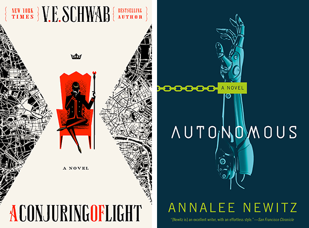
It’s quite hard for me to choose a favorite cover from Schwab’s Shades of Magic series so I chose to feature the latest one. I always appreciate it when covers in a series match so well and also stay true to the story contained within. As for Autonomous, I just love how the color palette and the illustration work so well together to create such a neat and bright cover.
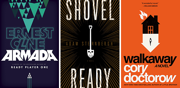
There’s nothing quite like taking a simpler approach to covers that tells the viewer something about the book itself; like the title and illustration complementing each other in the three covers above.
Working with Different Elements
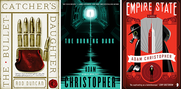
Duncan’s Fall of the Gas-Lit Empire series has some of the best atmospherically historic covers that I’ve come across. The first one is my favorite just because how it relays so much about Elizabeth by assembling a hand from bullets and a coin purse. On the other hand, Staehle is known for designing covers for almost all of Adam Christopher books and I think they’re done fantastically well using a straightforward approach. I chose my favorites from both the series.
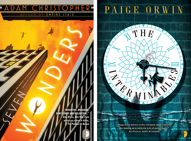
I love the clever play with space in the two covers above. They are both done so that the viewer can immediately tell what the stories inside the covers are possibly about which admittedly always has a chance of backfiring but here, the end results are great.
Which of these do you like best? Any cover designers that you’re a fan of?
I really like the Schwab covers in general but somehow I’m always struggling with the font which isn’t really my cup of tea…
All the covers look great though and it was definitely the work of the cover designer that made me notice Adam Christopher’s books and even get “Empire State” (which I still haven’t read, of course :D)
I never really pay attention to who designed certain book covers but I really like Joey Hi-Fi’s works for Chuck Wendig and Lauren Beukes, I’m still sad that the Miriam Black series got a redesign (even though I like the new covers as well).
Great topic! 🙂
Ooh, that’s the first time I’ve heard someone not liking the font. I get it though for me, I guess it matches the historical aspect of the story so I like it for that but, wouldn’t have all on its own.
Haha I really wish Adam Christopher’s books are worth it!
Same, though I just checked out Joey Hi-Fi’s covers and they’re all so great especially the original Miriam Black covers. It’d have been amazing to see what he came up with for the rest of the series’ covers but alas.
Thank you!
I am a sucker for book covers, in fact I buy books by the cover 😛
My TTT,
Haha I approve!
I am such a sucker for book covers as well and absolutely love these. The Interminables isn’t even a book I have heard of, but definitely one I would pick up based on the cover alone, love it. This artist is just so talented! Love your take on the open topic this tuesday!
I’ve actually read The Interminables and would definitely recommend it! It has such a great friendship and the story itself is very enjoyable.
Right? I hope we get more covers designed by him.
Thanks a lot!
OMG, these covers are all just *______* I’m not sure how I could possibly pick a favorite. I also had no idea they were all designed by the same person. oO
I was so excited when Autonomous got THAT cover. As if I wasn’t excited enough.
I love the covers for Empire State and Seven Wonders, but they both have such low ratings on GR. xD
Haha I was also quite shocked when I came to know he designed Armada’s and Shades of Magic series’ covers! What are the odds?
GAH, right?! I love it when an amazing book cover makes us that much more excited for a book.
LOL I really want to read them, though. XD
Autonomous is a very cool cover! I’ve never heard of this designer but I like his work. The Burning Dark is awesome, looks a little creepy?, and Seven wonders I LOVE that cover!
So cool! I was already excited for it and now even more because of that cover.
Yes, definitely looks creepy (and makes me want to read the book)!
Same! I also love the concept of Seven Wonders so I might just end up reading it.
I like all these covers (I’m a huge fan of the Shades of Magic covers!), but it never even occurred to me to think about the actual human behind the design. Now I’m curious if I have a favorite cover artist and didn’t even realize it!
I actually don’t know any cover artists apart from him, but I do think he’d be my favorite on the basis of the number of covers I like that are also designed by him.
Omg where is the heart eyes emoji when you need it because pretty sure that’s the exact descriptor for how I feel about all of these. LOVE the bold graphic design effect and these are perfection. Not sure I could pick a favourite out of these!
I know you’re using it just as an expression but GetEmoji is a great website for getting emojis on a browser. =P
I’m glad you like them all! =D
So many great covers! I think I’d pick up The Interminables just for the cover alone. 🙂
Lauren @ Always Me
Please do! I’ve actually read that one and it’s great.
I like the book covers you’ve chosen. They are pretty cool.
Here’s a link to my TTT post for this week: http://captivatedreader.blogspot.com/2017/01/top-ten-tuesday-freebie-top-ten.html
Thanks!
Oh my gosh, ALL of these covers are truly gorgeous. I would have all of those on display, quite happily 😀
As would I! =P
Great topic for your list! I like the covers of A Conjuring of Light and Autonomous the best (although I’m not a huge fan of the font on A Conjuring of Light). Seven Wonders and The Interminables are also very nice.
You’re the second person to say that about the font! It fits the story which is really my main reason for liking it.
I pay like zero attention to cover designers because I’m the worst apparently but I LOVE this artists’ style!! I’m totally in pure adoration of the Darker Shades series, so that probably makes me biased to love all his work. But seriously the fonts and colours and designs and just everything ahhhh. I’m a fan!
Tor actually mentions them on their website so I have kind of gotten into the habit of seeing more of their names on there and lately, have started paying a lot more attention than I did before.
Yes, they’re all so amazing!